Once you have added resources or banners, it helps to know where they land on the page and how they look, so you can write cards that fit.
Where to see it:
Open any live funnel's download page. The quickest way is the Funnels tab: click Edit on a funnel and use the Preview button next to Download Page in the Preview section. The address is yoursite.com/free/funnel-name/download/ (with your own URL Prefix). The Lists tab also has a download page preview button on every funnel row.
What a subscriber sees, top to bottom:
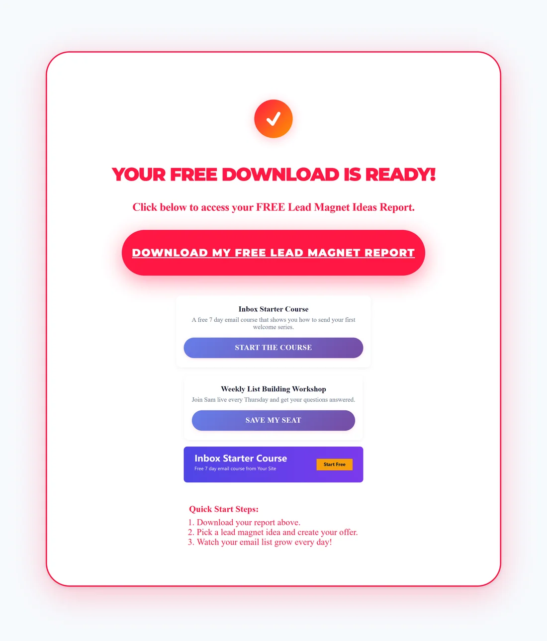
- The funnel's own heading, for example YOUR FREE DOWNLOAD IS READY!, with a line that names the free guide.
- The big download button that opens the PDF.
- Your Recommended Resources, one card each. A card shows the title in bold, the description under it and a full width button with your Button Text in capitals.
- Your banners, one under the other, each up to 420 pixels wide and centred.
- The rest of the funnel's page, such as its quick start steps, and the footer with Privacy Policy, Terms and Disclaimer.
Cards and banners are placed where the funnel's own single Recommended Resource box used to be. That box is replaced, so the page never shows both.
Every card and banner link opens in a new tab. The download page stays open, so the subscriber can still get the PDF.
Which set a page shows:
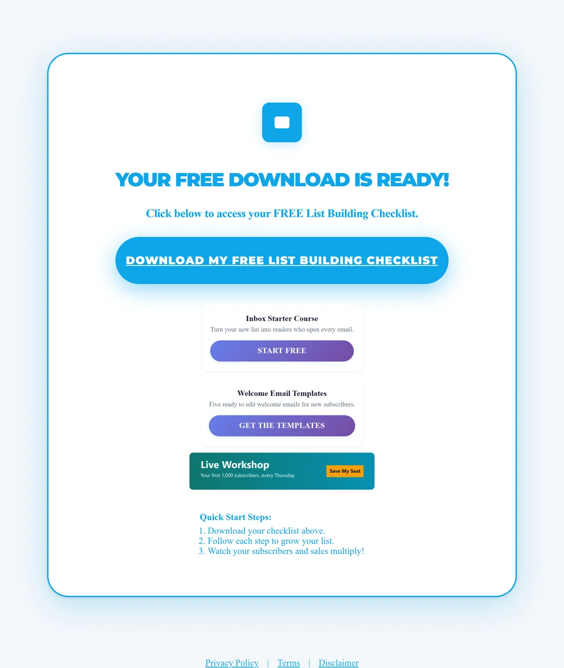
- A funnel with the override ticked on its Edit page shows its own resources and banners.
- Every other funnel shows the global resources and banners from Settings.
- With no resources and no banners anywhere, the page shows the funnel's single Recommended Resource box with your affiliate link. With no affiliate link set either, that box is left off, so the page never has a button that goes nowhere.
On phones:
The cards and banners shrink to the screen width and stack, so they read well on a phone. Check one page on your own phone after you change them.
A real example:
On Your Site, FREE 25 Lead Magnet Ideas Report uses the global settings, so its download page shows the Inbox Starter Course and Weekly List Building Workshop cards and the Inbox Starter Course banner. FREE Email List Building Checklist has an override, so its page shows Inbox Starter Course, Welcome Email Templates and the Live Workshop banner instead.
Tips:
- Keep descriptions to one line. Long text makes the cards tall and pushes the banners down.
- Visit a download page as a visitor would, in a private browser window. Your own visits as an administrator are not counted in your stats.
- To change the look of the download button itself, see The Download Page.